


Make a Statement with a Fresh Front Door Colour
Your front door is one of the first things people notice and the colour you choose can say a lot. Bold tones like deep blues, charcoals or rich reds can create contrast against neutral exteriors, while softer shades blend seamlessly for a more understated look. Darker colours can also absorb more heat, so it’s worth considering your home’s orientation, sun exposure and door material. Whether it’s a classic panelled door or a modern barn-style entry, the right paint choice can tie everything together.
White Clover Front Door
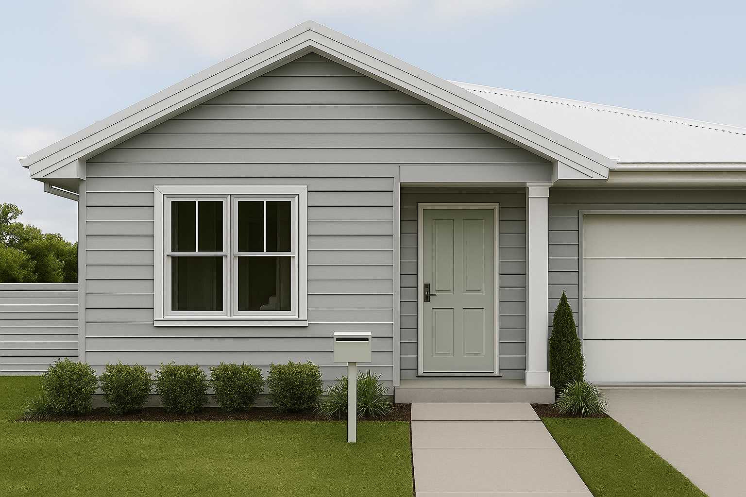
The soft green of White Clover on the front door adds a gentle contrast to the cool grey weatherboards and crisp white trims, a great option if your exterior features neutral or grey tones. For a durable finish, use a water or oil based enamel like Taubmans Ultimate Enamel or Taubmans Water Based Enamel to ensure scuff resistance and long lasting results.
Sailing Front Door
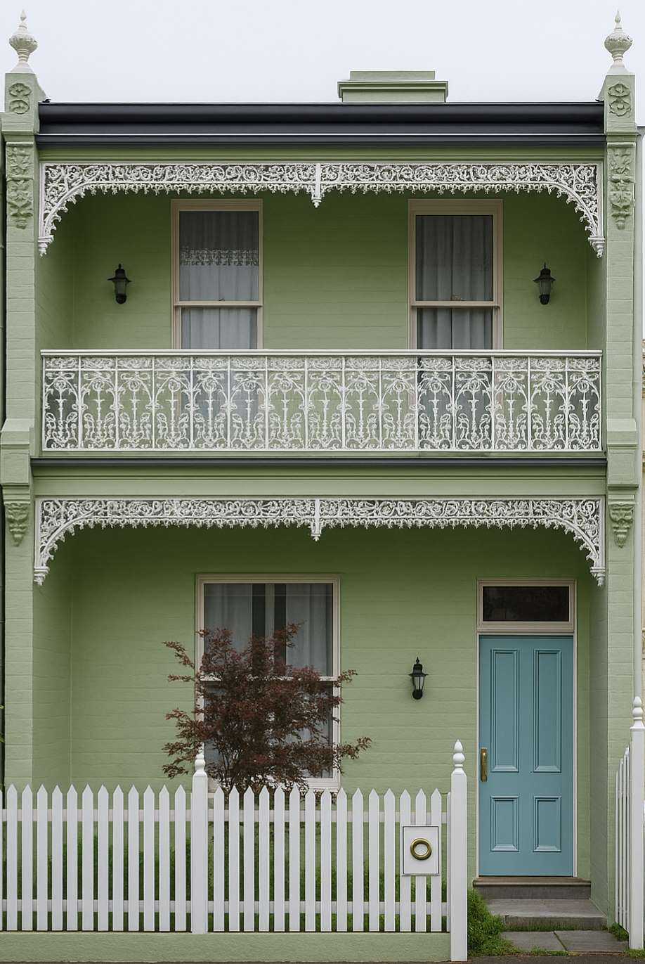
This Victorian terrace features a front door painted in Sailing, a soft blue that adds a refreshing focal point against the Tree Tops green facade. The combination brings a modern lift to classic architecture, offering a playful yet balanced exterior colour palette.
Tree Tops Front Door
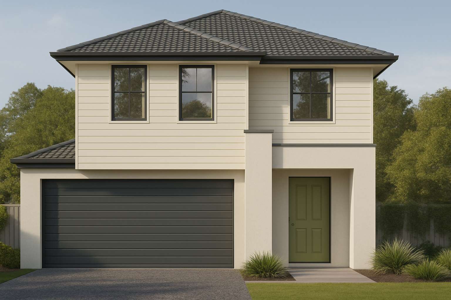
The Tree Tops front door introduces a bold yet balanced touch of colour that adds visual interest to an otherwise neutral exterior. This unexpected pop creates a modern look that feels fresh and different from the norm.


