



How Colour Changes the Way a Space is Experienced
Colour might be the most personal choice you can make in a home. It shapes far more than how a room looks. It shapes how it feels to walk in and live there. When a palette reflects the people who call a place home, the house stops feeling like a template and starts feeling like theirs.
That belief runs right through this renovated family home in Blackburn. "If the colours you choose reflect what you really love, it creates a space that feels like it belongs," says interior designer Carolyn Burns-McCrave of Burns-McCrave Design. Working with Taubmans, she chose to colour drench the home, wrapping colour across every surface to create something bold, cohesive and unmistakably personal.
What is colour drenching?
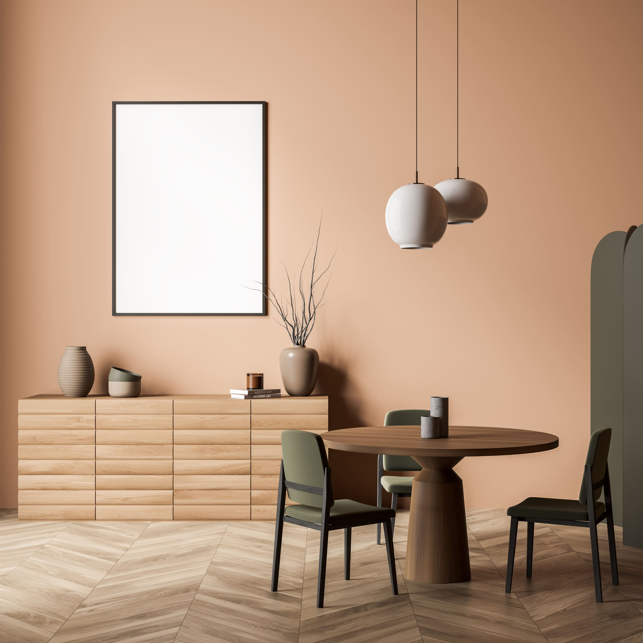
The technique at the heart of the home is colour drenching, painting the walls, the ceiling, the trims and the doors in a single colour. "I wanted something a little bit different to what's normally seen," Carolyn says.
Using colour as personal expression
For Carolyn, colour is never an afterthought. "Colour doesn't just impact your mood, it impacts your experience of the space," she says. The goal is a home that reads as an honest reflection of the people in it. "You want your friends to come in the door and go, this is just really you."
That takes a designer willing to push a little. "Whenever I'm working with builders or other trades, if I can't make them a little bit nervous about the colour palette, I haven't pushed the envelope far enough," Carolyn says. "On this project the builder was a surprisingly easy sell. He saw the vision straight away, backed the clients rather than talking them out of anything and simply said let's go for it."
It did more than make a statement. The home pairs a period style at the front with a modern extension at the back, each with its own trim and ornamentation. Carrying colour across every surface helped tie those two characters into one continuous home. And there is a visual payoff. "When you colour drench over the ceiling, it actually intensifies the colour, because everything's bouncing off each other," Carolyn says.
Building the palette: soft to bold
Rather than commit to one palette, Carolyn built a dynamic scheme that moves from gentle to intense. "I needed a brand that was going to give me lots of options, from really soft colours through to some really intense colours. Taubmans gave me all of that," she says.
In the front sitting room, Taubmans Mountain Wine sets a rich, enveloping tone. "It's just got so much depth and richness to it," Carolyn says. The room was painted solely in Mountain Wine. Before the wallpaper went in it looked boldly bare, but with the paper up it settles into something layered and warm.
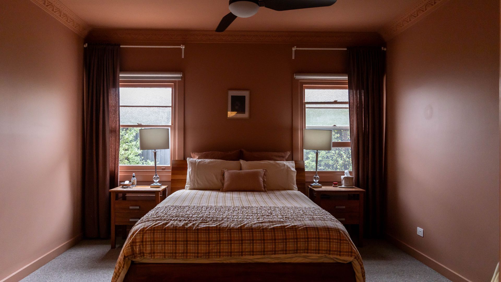
The master bedroom and ensuite share Taubmans Pale Russet, a colour Carolyn loves for the way it shifts through the day. "The best part is that this colour changes with the light," she says. Using the one colour across both rooms lets the light and the proportions do the rest, so each space feels a little different yet cohesive.
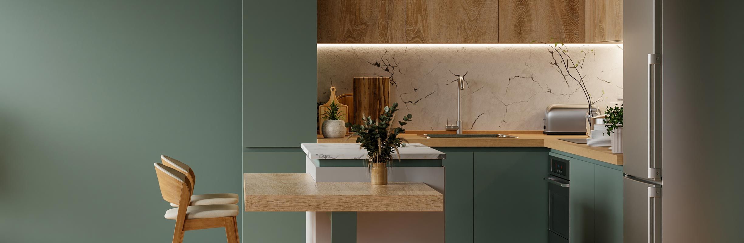
Out in the open plan living, Taubmans Sandy Beach, a soft blush, had to work alongside prefinished green cabinetry. "A pink that works with green can be a little tricky," Carolyn says. "Sandy Beach was just enough to complement it without fighting it."
Letting light lead: how orientation shapes a drenched colour
Colour was only half the transformation. The modern extension was designed to draw northern light deep into the home, reshaping the floor plan and opening up living spaces that simply were not there before. "It's allowed so much liveability in spaces that wouldn't have been otherwise," Carolyn says. That flood of natural light is what lets a single colour feel alive, reading one way in the morning and another by late afternoon.
The specification: products, sheens and surfaces
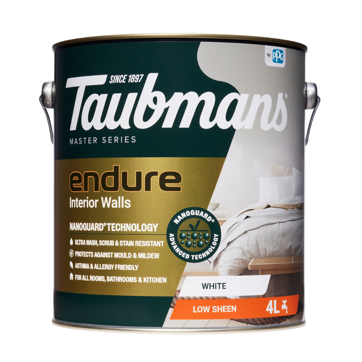
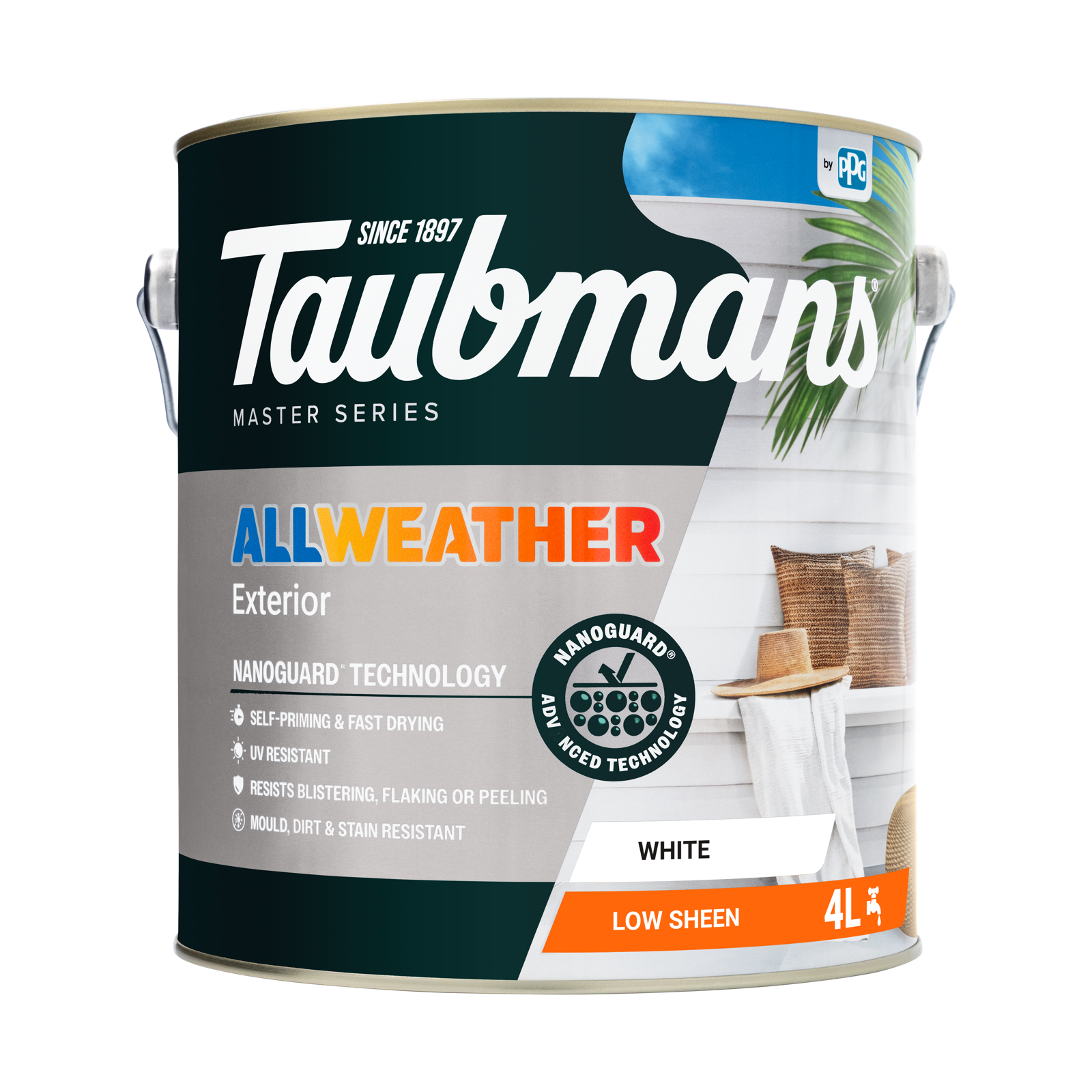
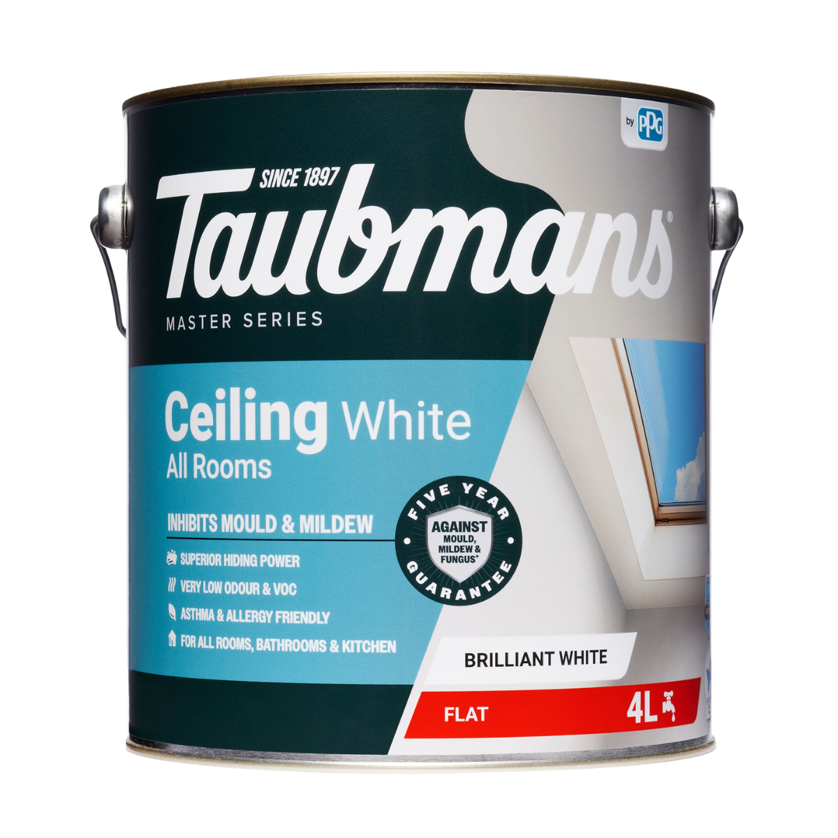
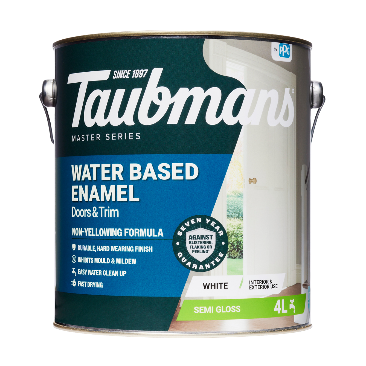
In a family home, the palette had to be as hardwearing as it is beautiful. Carolyn specified Taubmans Endure on the internal walls for its washability, an easy call for a young family. Taubmans Ceiling White went on the ceilings that stayed white. Taubmans Water Based Enamel finished the doors, trims and woodwork.
There was a sustainability motive too. Taubmans Endure is listed by Global GreenTag as a GreenRate Level A certified product, which made it a more sustainable choice for the home.
Holding the line on a bold palette
Carolyn's advice for anyone nervous about going bold is to hold your nerve. "You've got to trust the process. Wait until it's all done and don't freak out when that first bit of paint goes on," she says. Bold colour can look confronting on a bare wall. It is the furnishings, the light and the finishing touches that bring it into balance.
Delivering the brief
Colour drenching is not about being loud for its own sake. Done well, as it is here, it is about creating a home that could only belong to the people who live in it.
To explore the colours used in this home or start building your own palette, browse the Taubmans colour range online or visit your local Taubmans stockist. If you're feeling brave and want to try some bold colours, order a sample pot and paint it on a wall. It won't hurt to test a few options before you decide. Sample pots can be ordered through the colour pages on the Taubmans website.
Project details
Project location: Blackburn, VIC
Building & Interior Designer: Carolyn Burns-McCrave, Burns-McCrave Design
Builder: Uniform Building
Products used: Taubmans Endure (interior walls), Taubmans Ceiling White (ceilings), Taubmans Water Based Enamel (doors, trims and woodwork)
Colours used: Taubmans Mountain Wine, Taubmans Pale Russet, Taubmans Regimental, Taubmans Sandy Beach, Taubmans Sorrel Hide and Taubmans Snow Olive
Technique: Colour drenching
FAQ
Which Taubmans products were used in this home and on which surfaces?
Taubmans Endure (interior walls): washable and hardwearing for a young family, listed by Global GreenTag as GreenRate Level A certified, tintable to 1000s of colours.
Taubmans Ceiling White (ceilings): a clean dead flat finish for the ceilings.
Taubmans Water Based Enamel (doors, trims and woodwork): a durable enamel finish for timber surfaces that get handled every day.
What is colour drenching?
Colour drenching is painting every surface in a room, the walls, ceiling, trims and doors, in the same colour. It creates an immersive, enveloping effect and can make a colour feel richer as light bounces between the surfaces.
Is Taubmans Endure environmentally certified?
Yes. Taubmans Endure is listed by Global GreenTag as a GreenRate Level A certified product, which makes it a sustainable choice for interior walls.
How do you make bold colours work across a whole home?
Carry a connecting colour or tone from room to room, let natural light change how each hue reads and hold off judging a bold choice until the space is fully finished and furnished.